PANTHEON.tech’s developer Tibor Frank recently held a presentation at PyConSK19 in Bratislava. Here is his full-length presentation and some notes on top of it.
Motivation
Patterns, trends, and correlations that might remain undetected in text-based data can be exposed and recognized easier with data visualization.
Why do we need to visualize data? Because people like pictures and they hate piles of numbers. When we want or need to provide data to our audience, the best way how to communicate it is to display it. But we must display it in a form and structure our intended audience can consume. They must process the information in a fraction of second and in the correct way.
A real-world example
When I was building my house, a sales representative approached me and proposed, that he has the best thermal isolation for houses on the market.
He told me that it is 10% better than the second one and showed me this picture. Not a graph, a picture, as this is only a picture with one blue rectangle and two lines. From this point, I wasn’t interested in his product anymore. But I was curious about the price of this magic material. He told me that it is only 30% more expensive than the second one. Then I asked him to leave.
Of course, I was curious so I did some research later in the evening. I found the information about both materials and I visualized it with a few clicks in Excel.
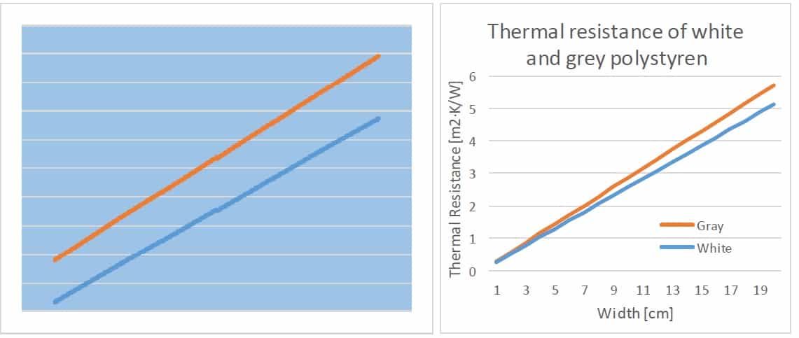
What’s the difference between these two visualizations? The first one is good only as an illustration in marketing materials.
From a technician point of view, I am missing information about what the graph is trying to show me:
- Title
- Axes with titles
- Numbers
- Physical quantities
- Legend
The same things which we were told to use at elementary school. It’s simple, isn’t it?
To be honest, this graph confirmed that his product is 10% better, but still, 30% more expensive.
Attributes of a good design
When we are talking about visualization we must also talk about design. In general, there are four attributes of a good design. It must be:
- Beautiful – because people must find pleasure in it
- Gratifying – to enjoy it
- Logical – everything should be in the right place; it must be self-descriptive, no need for further explanation
- Functional – the interactions between components must work and it must fit the bigger picture
Besides these attributes, we should choose the right point of view. Look at these two pictures. Which one do you like the best?

Do we want to show details? Or a bigger picture? Or both?
We need to decide before we start according to the nature of data we visualize, the information we want to communicate and the intended audience.
We must ask ourselves who will be the customer for our visualized data.
- Management
- Marketing
- Customers
- Skilled professionals
- Anyone
We should keep it in mind while preparing the visuals.
What do we visualize?
Data. Lots of data. 30GB of data, twice a day. Our data is the result of performance tests. I am working on an FD.io project which performs Continuous System and Integration Testing (CSIT) of the Vector Packet Processor (VPP). As I said, we focus on performance. The tests measure the packet throughput and packet latency in plenty of configurations of the VPP. For more information, visit FD.io’s website.
 So, what do we visualize?
1. Performance test results for the product release:
- Packet throughput
- Packet Latency
- Speedup multi-core throughput – increase in performance if we increase the number of processor cores used for data processing
2.Performance over a defined time period:
- Packet throughput trend
Where does the data come from?
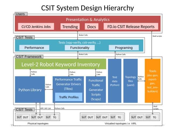
FD.io CSIT hierarchy (https://docs.fd.io/)
Jenkins runs thousands of tests on our test-beds and provides the results as robot frameworks’ output.xml files. The files are processed and the data from them visualized. As a final step we use Sphinx to generate html pages which are then published on the web.
What we use
Nothing surprising, we use standard python tools:
- Python 2.7 3.6
- Numpy
- Pandas
- Plot.ly
- Sphinx
I will not bother you with these tools, you might know them better than me.
Plots
We use Plot.ly in offline mode to generate various kinds of plots. Hundreds of dynamically generated plots are then put together by Sphinx to create the release Report or the Continuous Performance Trending.
I’ll start with the plots published in the Report. In general, we run all performance tests ten times to prevent any anomalies in the results. We calculate the mean value and standard deviation for all tests and then work with them.
Packet throughput – Statistical box plot

The elementary information about the performance is visualized by the statistical box plot. This kind of plot provides us all information about statistical data – minimum, first quartile, median, third quartile, maximum and outliers. This information is displayed in the hover box.
As you can see, the X-axis lists indices of individual test suites as listed in Graph Legend; and the Y-axis presents measured Packet throughput values [Mpps]. Both axes start with zero value so we know the scale. The tests in each plot are grouped and ordered by the chosen criteria. This grouping is written in the plot title (area, topology, processor architecture, NIC, frame size, number of cores, test type, measured property).
From this graph we can also see the variability of results – the results in the first graph are in all runs almost the same (there are lines instead of boxes), the results in the second one vary in a quite big range. It says that the reliability of these results are lower than in the first case and there might be an issue in the tested functionality, tests or infrastructure & more.
Packet Latency – Scatter plot with error bars

When we measure the packet latency, we get minimal, average and maximal values in both directions of data flows. The best way we found to visualize it, is the scatter plot with error bars.
The dot represents the average value and the error bars the minimum and maximum values.
The rest of the graph is similar to the previous one.
Speedup – Scatter plot with annotations

Speedup is the increase of the packet throughput if we increase the number of processor cores used for data processing. We measure the throughput using 1, 2 and 4 cores.
Again, we use the Scatter plot. The measured values are represented by dots connected by solid lines. In the ideal case, it would be a straight line. But it is not. So we added dashed lines to show how it would be in the ideal world. In real life, there are limitations not only in software but also in hardware. They are shown as dotted lines – Link, NIC, and PCIe bus limits. These limits cannot be overcome by the software.
3D Data
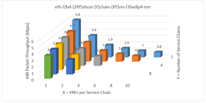
Some of our visualizations present three-dimensional data, in this example, the packet throughput is measured in a configuration with two changing parameters.
The easiest way to visualize it is to use excel and by a few clicks, we can create a graph like this one (above). It looks quite good but:
- The orientation in the graph is not so easy. What if there were 20 samples in a row?
- It is difficult to read the results
- In some cases, which are very probable, some bars can be hidden behind another one
- And Plot.ly does NOT support this kind of graph because, as they say, it is not needed. And they are right
So we had to look for a better solution. And we found the heat-map. It presents three-dimensional data in two-dimensional space. It is easy to process all information at one quick sight. We can quickly find any anomalies in this pattern as we expect the highest value to be in the top left corner and decreasing to the right and down.

Packet throughput trending – Scatter plot
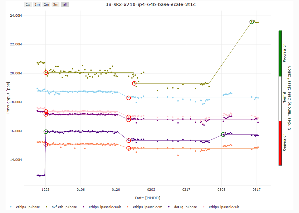
The trending graphs show us the trend of packet throughput over the chosen time period which is 90 days in this case. The data points (again average value of 10 samples) are displayed as dots. The trend lines are calculated by JumpAvg algorithm developed by our colleague. It is based on the minimum description length (MDL) principle.
What is important in the visualization of a trend, are changes in the trend. We mark them by color circles: red for regression and green for progression. These changes in trend can be easily spotted by testers and/or developers so we immediately know the effect of merged changes on the product performance.
[av_video src=’https://www.youtube.com/watch?v=vu0iPnDqhik&t=6977s’ format=’16-9′ width=’16’ height=’9′ custom_class=” av_uid=’av-36owbn’]


![[What Is] VLAN & VXLAN](https://pantheontech1.b-cdn.net/wp-content/uploads/2025/04/vxlan-vpp-thumb-400x250.png)
![[What Is] Whitebox Networking?](https://pantheontech1.b-cdn.net/wp-content/uploads/2025/03/whitebox-net-thumb-400x250.png)
![[What Is] BGP EVPN?](https://pantheontech1.b-cdn.net/wp-content/uploads/2025/03/bgp-evpn-thumb-400x250.png)